Cognitive Walkthrough vs. Heuristic Evaluation: Which UX Method Drives Better ROI?

14minutes read
heuristic evaluation vs cognitive walkthrough

It’s easy for even the smartest teams to lose touch with the people they’re designing for. You might be shocked to hear that 43% of organizations still don't have a clear process for letting user feedback shape their decisions. Instead of data, companies rely on internal debates and best guesses, hoping their instincts align with reality. It’s a risky way to work, but it’s common because genuine user insight is often treated as a luxury rather than a requirement.

This disconnect starts at the top. With only 13% of companies having UX representation in the C-suite, design happens in silos, cut off from the strategic vision it needs to thrive. The result is "assumption-driven" audits, where your team fixes what they think is broken, rather than what’s frustrating the user. It’s well-intentioned, but leaves massive blind spots that can cripple a product’s ROI potential.

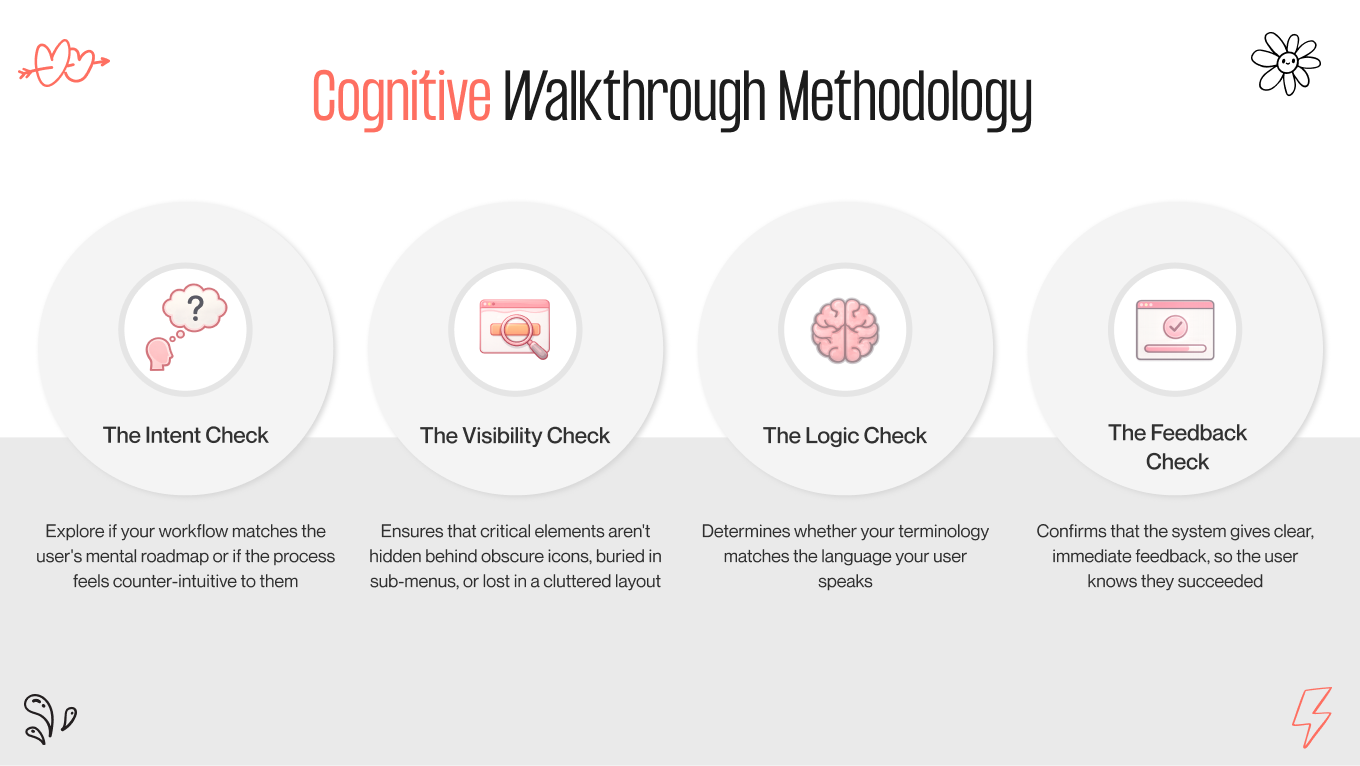
That’s where our guide may come in handy. We’re going to step away from the guesswork and break down two fundamental reality checks: cognitive walkthroughs vs heuristic evaluations. We’ll explore how these methods differ, where they overlap, and how you can use them to build a design culture that listens rather than assumes.

Key Takeaways

  • Cognitive walkthroughs focus on people, testing whether first-time users can understand and complete tasks without guidance.

  • Heuristic evaluations focus on the product, checking the interface against established usability principles for consistency and clarity.

  • Combining both methods uncovers logic gaps and design inconsistencies early, saving time, money, and user frustration.

  • Early-stage walkthroughs catch cheap-to-fix errors, while heuristic evaluations polish high-fidelity designs to feel professional and intuitive.

  • Proactive UX audits prevent costly post-launch fixes, improve adoption, and build trust by respecting users’ time and expectations.

Cognitive Walkthrough vs Heuristic Evaluation: Side-by-Side Comparison

At first glance, these two methods may seem like the same shortcut. Experts review the product without involving real users, which makes both approaches quicker and easier to fit into tight schedules. However, confusing them is a strategic mistake. They reveal different types of problems, and mixing them up can lead your team astray.

Think of it this way:

  • Cognitive walkthrough is a scenario-driven logic check. An expert takes on the perspective of a user with a specific goal and goes through each step of the journey. The focus is on user intent, decision-making, and obstacles in real tasks. It asks, "Does this flow make sense?"

  • Heuristic evaluation is a principle-driven standards check. Instead of following a single path, it examines the entire interface against established usability rules and UX principles (consistency, clarity, system feedback, and error management) throughout the product. It asks, "Is this built correctly?"

How to Choose the Right Method

To help you decide which lever to pull, here is the strategic breakdown of how they compare across the metrics that matter most to your product roadmap.

Feature

Cognitive walkthrough

Heuristic evaluation

Primary focus

Task success. Can a new user figure out how to complete a specific goal (e.g., "Purchase a subscription")?

System health. Does the interface violate established usability principles (e.g., "Are error messages clear?")?

The "vibe"

Linear and narrative. It follows a story.

Holistic and systematic. It scans the whole environment.

Ideal timing

Early stage. Perfect for wireframes and prototypes when the "logic" is being defined.

Mid-to-late stage. Best for reviewing high-fidelity designs or auditing live products for friction points.

Who does it?

  • Product Manager

  • UX Designers

  • Subject matter experts role-playing as users

  • 3-5 usability experts trained in human-computer interaction principles.

The output

A list of bottlenecks where users might get stuck or confused.

A prioritized list of usability violations rated by severity.

In simple terms: if your analytics show users abandoning the signup halfway through, a cognitive walkthrough helps you figure out where the journey breaks and why the next step isn’t obvious.

But if users describe your app as “clunky,” “outdated,” or “hard to use,” that’s a sign you need a heuristic evaluation. It will allow you to spot UX rule violations, inconsistencies, and design issues that make the whole interface feel rough or unpolished.

User experience shouldn't be a guessing game. If you see the data but aren’t sure how to fix the "why," we’d love to take a look with you.

What is a Heuristic Evaluation in UX?

If a cognitive walkthrough is a “test drive”, a heuristic evaluation is more like a “mechanic’s inspection.” Here, it doesn't ask if the user can drive the car; it checks if the brakes, steering, and engine meet safety standards.

In UX design, a heuristic evaluation is a structured expert review of an interface’s usability. A small group of specialists, usually 3 to 5 UX professionals, examines the product and compares it against established usability principles, known as heuristics. These principles cover areas such as consistency, visibility into system status, error prevention, and user control.

The method was introduced by Jakob Nielsen and Rolf Molich in the 1990s. Even though tools, platforms, and devices have evolved, human cognitive behavior hasn’t changed much. That’s the reason why heuristic evaluation remains one of the fastest and most cost-effective ways to identify basic UX problems before real users experience issues.

The 10 Commandments of UX

While there are many lists, Nielsen’s 10 Usability Heuristics remain the industry gold standard. However, in 2026, we view them through a modern lens:

  1. Visibility of System Status: Don’t make users wonder if something worked. If they click “Pay,” provide immediate feedback, like a loading state, confirmation message, or progress indicator, so they know the system is responding.
  2. Match Between the System and the Real World: Speak like a user, not a developer. Use familiar words and concepts that your users already understand. Avoid internal terminology or technical jargon that only your team recognizes.
  3. User Control and Freedom: People will click the wrong thing. Allow them to recover easily with clear Undo, Back, or Cancel options, without forcing them through a long, rigid process just to fix a small mistake.
  4. Consistency and Standards: Follow established patterns instead of creating your own rules. If a gear icon means Settings everywhere else, don’t suddenly change it for Logout. Familiarity reduces cognitive load.
  5. Error Prevention: Helpful error messages are good, but smart design that prevents errors before they happen is even better. Use validation, constraints, and clear cues to guide users away from mistakes.
  6. Recognition Rather Than Recall: Don’t make users rely on memory. Show options, labels, and context directly in the interface. If users have to remember information from a previous screen, you’re adding unnecessary friction.
  7. Flexibility and Efficiency of Use: Design for both beginners and experts. Keep the interface intuitive for new users while offering shortcuts, presets, or automation for power users who want to move faster.
  8. Aesthetic and Minimalist Design: Every extra element competes for attention. Remove anything that doesn’t serve a clear purpose. Clean interfaces help users focus on what really matters.
  9. Help Users Recognize, Diagnose, and Recover from Errors: When something goes wrong, explain it clearly. Avoid cryptic codes or vague messages. Tell users what happened, why it happened, and what they can do next.
  10. Help and Documentation: The best user experience needs no manual; when help is necessary, it should be easy to find, searchable, and directly connected to the user’s current task, not buried in a generic knowledge base.
10 usability heuristics

Why Choose the Heuristic Evaluation Method?

While user testing shows what users do, a heuristic evaluation helps you understand where and why the system fails them. That’s why it’s often the first step in a UX audit; it avoids the hassle of recruiting, scheduling, and managing real participants while still providing valuable insights.

  • Scalability: Whether you’re reviewing a single checkout modal or a large CRM, the process remains simple. You can focus on one feature or look at an entire platform without the chaos and expense of coordinating many test users.

  • Speed: In today’s product cycles, speed is essential; it’s considered a feature that gives you a competitive advantage. Skilled evaluators can identify major usability issues in days instead of weeks. This makes heuristic evaluation particularly useful for Agile teams that need clear insights within a sprint, not over several months.

  • Unhindered by "Happy Paths": Real users usually try to finish tasks quickly by doing the “right” thing. They don’t intentionally explore edge cases or break things. Expert evaluators do the opposite. They deliberately test flows under stress, examine error states, and push the interface into challenging situations to see how robust it really is.

Most mature products don’t lose users because of one big mistake. They lose them through many small frustrations: inconsistent icons, cluttered menus, conflicting patterns, and feature creep. A heuristic evaluation is one of the quickest ways to uncover this accumulated design debt, reset your UX standards, and reduce churn before it worsens.

A Deep Dive into the Cognitive Walkthrough Methodology

A cognitive walkthrough is like entering a space for the first time and trying to understand how everything works, without any guidance. Instead of questioning if the system is technically correct, it poses a more relatable question: Is this easy to learn?

Rooted in cognitive psychology, this method focuses on the First-Time User Experience (FTUE). It assumes that your user is smart, motivated, and goal-oriented, but entirely new to your interface. The evaluator’s role is to identify gaps between what people expect to happen and what the product actually requires them to do.

4 Questions to Stress Test for User Logic

During a cognitive walkthrough, an evaluator steps into the shoes of a real user and goes through a specific task, like inviting a new team member or setting up a first project. At each step, they challenge the interface with four key questions. 

If any answer is “no,” you’ve found a usability issue. 

  1. Will the user try to achieve the right effect? Does this step feel natural and necessary to reach their goal, or does the workflow seem unexpected and confusing?

  2. Will the user notice that the correct action is available? Is the action clear and visible, or hidden behind menus, icons, or other layers? Users can’t interact with what they don’t notice.

  3. Will the user associate the correct action with the effect they are trying to achieve? Does the label, icon, or wording match what they expect? If they want to “save” but the button says "commit," they will hesitate.

If the correct action is performed, will the user see that progress is being made? After the action, does the system clearly confirm progress? If the feedback is subtle or missing, users will think something went wrong and will start clicking repeatedly.

cognitive walkthrough methodology
4 questions to stress test for user logic

The Value of Cognitive Walkthrough

A cognitive walkthrough is your first line of defense against costly support tickets and low adoption rates. While many UX methods check whether a system can be used, this one asks a more practical question: Can someone figure it out without a manual, a tutorial, or a teammate hovering over their shoulder?

It’s designed for people who don’t know your internal terms and haven’t memorized your shortcuts. That’s why it’s especially effective for high-stakes, multi-step processes like SaaS onboarding, e-commerce checkout, or banking transfers. In these situations, even a small moment of confusion can lead to instant abandonment.

When you eliminate those mental obstacles, you reduce the Time to Value. Users grasp the product faster, reach their “Aha!” moment sooner, and are much more likely to convert from trial to paying customers.

We often tell clients that a cognitive walkthrough is the “first date” of UX. You don’t have months to impress anymore; there are only seconds. If a user feels lost or uncomfortable during that first interaction, they’ll blame the product and quietly leave. This method helps make sure your product feels intuitive, confident, and welcoming from the very first click. This way, you earn that second date, or retention, before they even realize they’re committed.

If your first interaction isn't hitting the mark, we can help you turn that awkward first click into a long-term commitment. Book a UX audit with our team and let’s make sure your product earns that second date.

Heuristic Evaluation vs Cognitive Walkthrough: When to Use Which

Choosing between cognitive walkthrough vs heuristic evaluation is about picking the right tool for your product's current lifecycle stage. Using a heuristic evaluation on a wireframe is often overkill, while utilizing a cognitive walkthrough on a messy legacy app might miss the forest for the trees.

Here is your strategic guide to deployment.

Cognitive Walkthrough for the "Napkin Sketch" Phase

Best For: Early prototyping, new feature definitions, complex workflows.

When your product is just an idea on a whiteboard or a basic wireframe in Figma, focusing on pixel perfection isn’t important. What really matters is whether the main concept makes sense to someone who didn’t create it.

This is where a cognitive walkthrough becomes very useful.

At this stage, a detailed evaluation is usually unnecessary. There’s no reason to get caught up in typography or spacing in a rough draft. Instead, the cognitive walkthrough serves as a way to check the logic. It tests the sequence of steps, assumptions, and decision points before you spend significant time and money on development.

The Scenario

Imagine you’re creating a complex multi-user checkout flow for a B2B platform. During a cognitive walkthrough, you act out the user’s journey step by step. You might ask: “If I’m the admin, do I assign seats before or after payment?” Or: “Why do I need to provide shipping details before adding team members?” Suddenly, you see that the flow conflicts with how users naturally think. What seemed logical in a product meeting becomes confusing in real use.

Why Cognitive Walkthrough Wins Here

It finds structural issues when they are easiest to fix. By making the team simulate the journey on paper, you highlight logic gaps that would later need costly redesigns or major changes. It turns “I think this makes sense” into “I know this flow works.”

Heuristic Evaluation for the "Polish and Publish" Phase

Best For: Pre-launch audits, redesigning legacy systems, QA checks.

Once your product is functional, or at least a high-fidelity prototype, the question shifts. It’s no longer “Does this make sense?” but “Is this built to professional UX standards?” That’s where heuristic evaluation comes in.

By this stage, your logic is sound. The problem often lies in subtle friction, the kind that slowly diminishes trust and satisfaction.

The Scenario

Imagine a SaaS platform that has been live for three years. It works. Users complete tasks. Revenue is coming in. But feedback sounds like this: “It feels clunky.” “It looks dated.” “I don’t fully trust it.” This rarely stems from a single major bug. It’s the result of feature creep. Different designers contribute multiple patterns, inconsistent icons, mixed typography, and UI decisions that accumulate over time without a cohesive system.

Why Heuristic Evaluation Wins Here

A cognitive walkthrough might pass this interface because users can technically finish tasks. A heuristic evaluation won’t be as lenient. The evaluator acts like a UX quality inspector, systematically searching for accumulated design debt: 

  • Inconsistent icons and terminology 

  • Error messages that speak in code instead of plain language 

  • Navigation patterns that change unpredictably 

  • Missing feedback and unclear states 

As a result, you change a product that just works into one that feels intentional, reliable, and high-quality.

How to Choose Between Heuristic Evaluation and Cognitive Walkthrough Depending on Your Resources

Sometimes, the choice is about what you realistically have available right now: time, money, or both. 

  • If you have time but no budget: Run an internal cognitive walkthrough. Ask designers or PMs to review each other’s flows and pretend to be the user. Give them a specific task, such as “Sign up as a new team admin” or “Complete checkout with three users,” and have them explain their thought process out loud. It’s not perfect; internal bias is real, and your team already knows how things should work. However, it’s free, quick to set up, and great for revealing broken logic, missing steps, and confusing flows before users encounter them. 

  • If you have a budget but no time: Hire an external agency for a heuristic evaluation. Experienced UX auditors can review an entire platform in 48 to 72 hours and provide a structured, prioritized list of usability issues, ranked by severity and impact. Your dev team can treat it like a punch list: tackle quick wins first, then work on strategic fixes. This is the quickest way to improve UX quality when deadlines are tight, and you need expert, unbiased feedback right away.
ux audit decision matrix
how to make the right choice

Starting a UX audit now helps you reduce friction, improve adoption, and build trust with users — contact us today.

How to Combine Cognitive Walkthrough vs Heuristic Evaluation for a Bulletproof UX Audit

We don’t view these methods as separate “tests” to pass. They are two parts of a complete experience: one focuses on mechanics and the other on humanity. 

Choosing between heuristic evaluation vs cognitive walkthrough leaves your picture incomplete. 

  • Heuristics ensure your product meets the guidelines of good design. 

  • Walkthroughs check whether your product actually works for the people using it. 

Think of it like getting a home ready for guests. 

Heuristic evaluation is the inspection: Is the roof solid? Do the lights function? Are the floors even?

Cognitive walkthrough is the hospitality: When your guests arrive, do they feel welcome? Is it clear where to hang their coats? Does the layout of the rooms flow naturally?

You can have a house that passes every inspection but feels cold and confusing. Or you can have a warm, inviting layout spoiled by a door handle that falls off. To create a product people love, you need both safety and soul, as well as the confidence that it works and the joy that it feels easy to use.

The Natural Order

To create a seamless, meaningful user experience, we follow a two-step process: explore first, then refine. 

  • Mapping the journey with a cognitive walkthrough. Before anything looks polished, we trace the user’s path. Every click, swipe, or decision is examined from their point of view. This is where we identify confusion, dead ends, and unexpected detours, while it’s still easy to adjust the design and try different flows. Think of it as finding the story before writing the final draft. 

  • Polishing the experience with heuristic evaluation. Once the journey makes sense, we shift our focus to craftsmanship. Our team tightens interactions, standardizes layouts, and ensures every button, label, and transition feels deliberate and consistent. This step turns a functional path into an elegant, professional experience. 

The magic happens when these two steps work together. Walkthroughs reveal the reasons behind user struggles, while heuristics ensure the interface's quality. When layered properly, these methods allow users to navigate your product naturally, without a manual. This way, you reduce friction and create a product that feels intuitive, trustworthy, and easy to use.

Trust Your Product to a Team That Sees the Whole Picture

At Gapsy Studio, we understand that handing over your product for a UX research and audit can feel vulnerable. You’ve poured months, maybe years, into building this. It’s not just code and pixels; it’s your vision.

That’s why we treat it as a care plan.

When you partner with us, you aren't just hiring a checklist of heuristics; you are gaining a dedicated team of senior strategists who understand the human side of business. We know that behind every "drop-off rate" is a frustrated person, and behind every "conversion" is a moment of trust.

Here’s why founders and product leaders trust us:

  • We bring fresh eyes with deep experience: Your internal team works too hard to see the friction anymore. We bring the necessary distance to spot the invisible blockers, backed by the expertise to know exactly how to fix them.

  • We speak "human," not just "dev": We don't just hand you a spreadsheet of error codes. We translate technical findings into a clear, prioritized roadmap that connects design fixes to business growth.

  • We audit with empathy: We look for moments when your users feel lost, anxious, or unheard, and consult with you to find solutions. Our goal isn't just to make your product "correct" — it's to make it feel effortless.

Create Exceptional Experiences with Gapsy!

Want to enhance your online presence? We're here to help you achieve it.

Summing Up

It’s easy to skip the UX audit and go straight to launch. People often think, “We’ll fix it later.” But in our experience, “later” is the costliest word in product development.

The real choice isn’t between a heuristic evaluation and a cognitive walkthrough. It’s about planning ahead versus cleaning up problems afterward.

A logic error found during a cognitive walkthrough of a wireframe can be fixed in just a few minutes. The same mistake found during a heuristic evaluation of a pre-launch build can take hours or even days of developer work. If it gets missed until after launch, when users are frustrated and abandon your product, it can be much more costly than time — it can harm your reputation.

Your users don’t care about the methods you use. They want a product that respects their time, communicates clearly, and helps them complete tasks smoothly. Focus on those needs, and you build trust. Neglect them, and even small UX issues can turn into significant obstacles.

Not sure if your user experience has any issues? Gapsy Studio is ready to evaluate your design — let’s have a conversation.

Rate this article

20 ratings
Average: 4.9 out of 5

If you like what we write, we recommend subscribing to our mailing list to always be aware of new publications.

Do you have any questions? We tried to answer most of them!